
Education without visual noise
Colour and illustrative details create a friendly character without competing with the product name and purpose.
Case study · Education and online sales
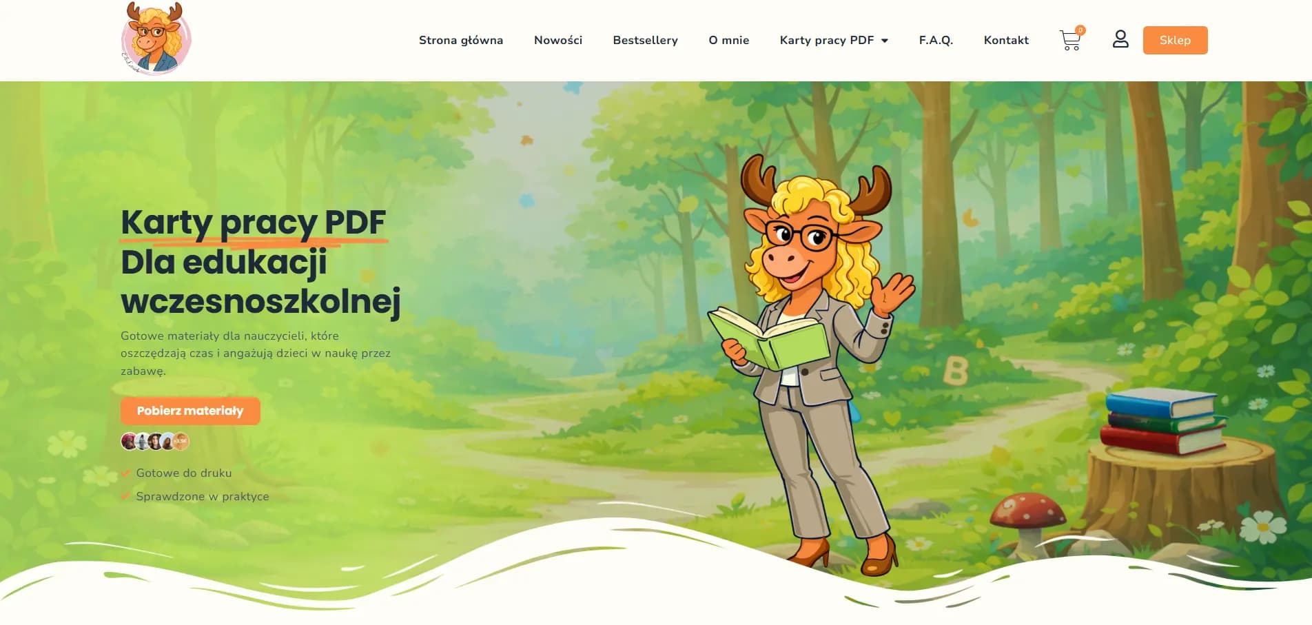
A friendly educational store with clear categories, a light visual direction and a simple journey from finding a resource to purchasing it.
Project context
The products are created for parents, teachers and professionals working with children. A broad catalogue required clear organisation and a calm, trustworthy visual language.
Make the right materials easier to find, build a consistent brand character and provide a convenient purchase journey on mobile.
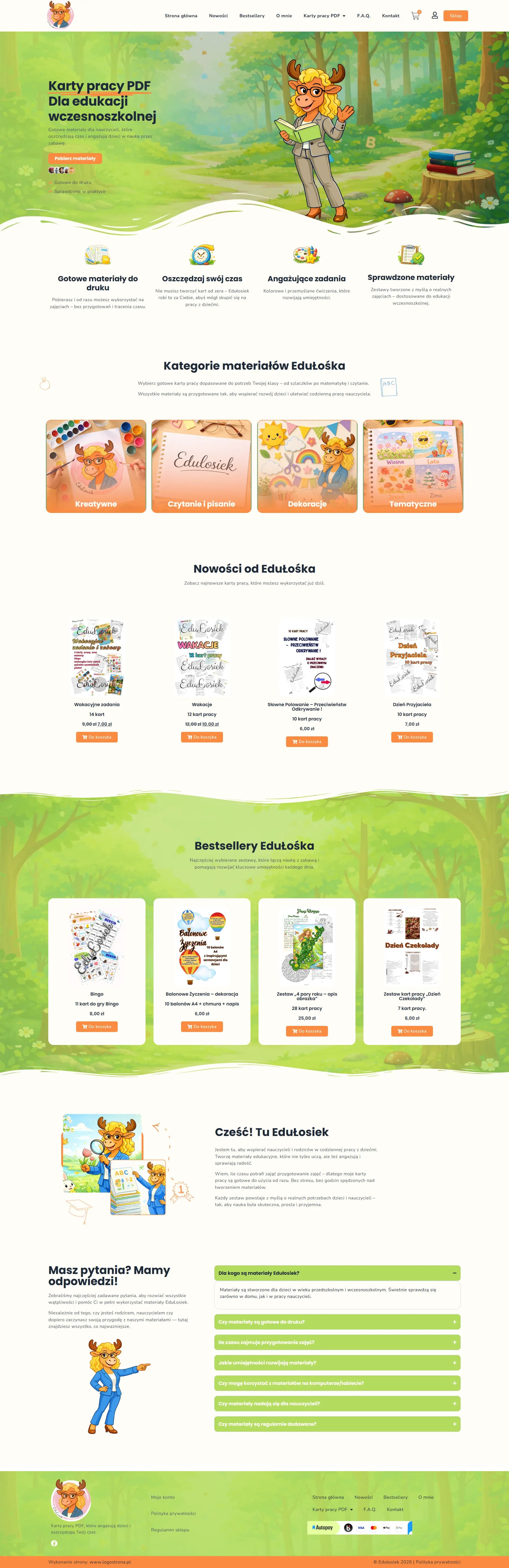
We used a light palette, clear product cards and distinct categories. Information about each resource, its benefits and the purchase is available without unnecessary layers.
The project created an organised online store that combines the brand's educational personality with a functional presentation of digital products.
Key decisions
Scope of work
Colour and illustrative details create a friendly character without competing with the product name and purpose.
The catalogue and cards make it easy to compare resources and move to the relevant category or product.
The most important information and actions remain clear on small screens, where purchase decisions often begin.
Project view
Next case study
A premium chocolate brand experience combining product storytelling, the collection, customer voices and a partnership offer.
View project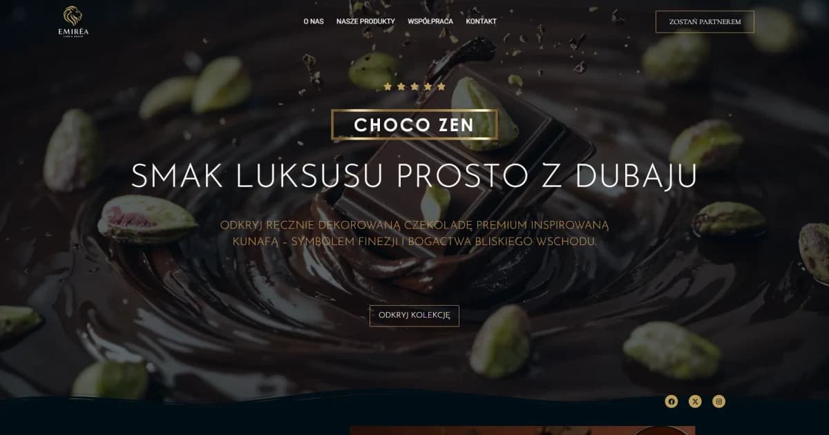
Let us discuss your website
We will begin with your goal, audience and scope. The quote is free and carries no obligation.